CSS3 animation 动画属性
CSS3 animation 属性,可以创建动画,可以取代许多网页动画图像,如Flash动画,和JAVAScripts。
同样也可参考 jQuery animate() 方法。
语法
animation: name duration timing-function delay iteration-count direction fill-mode play-state;
注解
animation-name	指定要绑定到选择器的关键帧的名称
animation-duration	动画指定需要多少秒或毫秒完成
animation-timing-function	设置动画将如何完成一个周期
animation-delay	设置动画在启动前的延迟间隔。
animation-iteration-count	定义动画的播放次数。
animation-direction	指定是否应该轮流反向播放动画。
CSS3 @keyframes 规则
要创建CSS3动画,就得了解@keyframes规则。
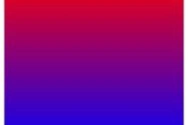
@keyframes规则是创建动画。 @keyframes规则内指定一个CSS样式和动画将逐步从目前的样式更改为新的样式。
@keyframes myfirst
{
	from {background: red;}
	to {background: yellow;}
}

@-webkit-keyframes myfirst /* Safari and Chrome */
{
	from {background: red;}
	to {background: yellow;}
}
浏览器支持
Internet Explorer 10,Firefox,Opera 和 Google Chrome Safari 支持 CSS3 animation(动画)属性。
Safari和Chrome通过私有属性 -WebKit-animation 支持。
注意: Internet Explorer 9 及更早IE版本不支持动画属性。
使用方法
使用简写CSS属性把 animation 绑定到一个
元素:
div{
	animation:mymove 5s infinite;
	-webkit-animation:mymove 5s infinite; /* Safari 和 Chrome */
}
注解
默认值:	none 0 ease 0 1 normal
继承:	no
版本:	CSS3
JavaScript 语法:	object.style.animation="mymove 5s infinite"
示例
<!DOCTYPE html>
<html>
<head>
<style>
.test{
	width:100px;
	height:100px;
	background:red;
	position:relative;
	animation:my_style_move 5s infinite;
	-webkit-animation:my_style_move 5s infinite; /*Safari and Chrome*/
}

@keyframes my_style_move
{
	from {left:0px;}
	to {left:200px;}
}

@-webkit-keyframes my_style_move /*Safari and Chrome*/
{
	from {left:0px;}
	to {left:200px;}
}
</style>
</head>
<body>

<p>注意: Internet Explorer 9 及更早IE版本不支持动画属性。</p>

<div class="test"></div>

</body>
</html>
再看一个示例
<!DOCTYPE html>
<html>
<head>
<style>
div
{
	width:100px;
	height:100px;
	background:red;
	animation:myfirst 5s;
	-moz-animation:myfirst 5s; /* Firefox */
	-webkit-animation:myfirst 5s; /* Safari and Chrome */
	-o-animation:myfirst 5s; /* Opera */
}

@keyframes myfirst
{
	0%   {background:red;}
	25%  {background:yellow;}
	50%  {background:blue;}
	100% {background:green;}
}

@-moz-keyframes myfirst /* Firefox */
{
	0%   {background:red;}
	25%  {background:yellow;}
	50%  {background:blue;}
	100% {background:green;}
}

@-webkit-keyframes myfirst /* Safari and Chrome */
{
	0%   {background:red;}
	25%  {background:yellow;}
	50%  {background:blue;}
	100% {background:green;}
}

@-o-keyframes myfirst /* Opera */
{
	0%   {background:red;}
	25%  {background:yellow;}
	50%  {background:blue;}
	100% {background:green;}
}
</style>
</head>
<body>

<div></div>

<p><b>注释: </b>当动画完成时,会变回初始的样式。</p>


<p><b>注意: </b> 该实例在 Internet Explorer 9 及更早 IE 版本是无效的。</p>

</body>
</html>